
Better World Flux was created in Australia to raise awareness for the UN Millennium Development Goals . Teachers and students can create, visualize and share stories that are hidden in the World Bank Open Data.
This image presents data showing Australia’s own measure of happiness compared with countries across the world. The data shows us we are doing pretty well. It also shows that comparatively we seem to be getting happier. I wonder why?
What could be the factors affecting this statistic? What stories do the numbers tell. 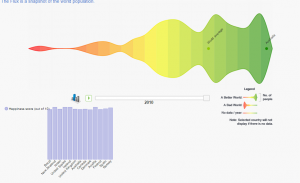
Teachers could get students to:
- build an ideal composite of what they think matters in life
- track the progress of countries and the world over the years and find interesting trends and patterns
- see which countries need the most help and find the ideal country to live in
- see which countries need the most help
- find the ideal country to live in based on your preferences
- explore and navigate the raw data for each country.
- Check it out at http://betterworldflux.com